From Idea to Icon: How We Designed Lucy’s Logo From Scratch
Designing a logo isn’t just about making something that looks cool — it’s about creating a visual identity that works everywhere: on a website, social media, business cards, or even a hoodie. When I set out to design the logo for Lucy, I wanted it to feel clean, modern, and futuristic without being overwhelming. Here’s exactly how we did it, step by step.
Step 1: Start With a Vision
Before jumping into any design tools, I wrote down what I wanted the Lucy and Ask Lucy logos to feel like:
-
A tech-futuristic vibe (but approachable).
-
Easy-to-read cursive for the word “Lucy.”
-
Black backgrounds, white text, and purple highlights (to match my website’s theme).
-
Something that would look just as good on a hoodie as it does on a website header.
This “design north star” made it easier to stay on track when trying out tools.
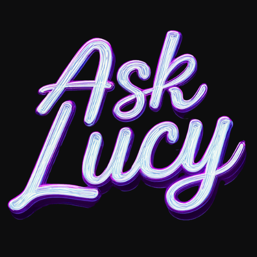
Step 2: Generate First Drafts With AI
Instead of starting with a blank canvas, I turned to AI design tools like MidJourney and Google’s Nano Banana (ImageFX). These tools are great at turning words into visuals quickly.
The initial prompt I used looked something like this:
“Logo design for ‘Lucy’ in clean, futuristic cursive. Black background, white text with subtle purple highlights. No clutter, no icons. Must be easy to read and suitable for clothing printing.”
The results were strong — especially for exploring different typefaces and effects.
Step 3: Identify Problems (and Fix Them)
Like many AI-generated images, the first versions weren’t perfect. A few issues came up:
-
Icons/Watermarks at the Bottom: MidJourney often adds small extra marks.
-
Backgrounds: The logo wasn’t transparent, which would have caused issues when layering it onto different backgrounds.
The Fix
-
I used Canva Pro’s Background Remover tool to erase the icons and clean things up.
-
I exported the logo as a transparent PNG, which became my master file — the version I can use anywhere.
Step 4: Create a Master PNG
The transparent PNG is the cornerstone of the logo system. With it, you can create:
-
Full color versions (for digital splash).
-
Monochrome versions (for print, merch, embroidery).
-
Different sizes and crops (for social media, banners, favicons).
Without this step, you risk having logos that look awkward on some backgrounds or lose detail when resized.
Step 5: Build Out Versions for Every Use Case
Once I had the clean master logo, I used Canva to create multiple versions:
-
Website Header (wide and sleek).
-
Social Media Profiles (square 1080×1080).
-
YouTube Banner (2560×1440).
-
Favicon (tiny 32×32 icon for browsers).
-
Shirt Mockups (to make sure it looks good in print).
This ensures Lucy’s brand identity is consistent and recognizable across every platform.
Lessons Learned Along the Way
-
AI gives you speed, but not perfection. Expect to edit outputs to make them usable.
-
Start with a clear vision. Knowing your colors, style, and tone saves tons of time.
-
Always export a transparent PNG. This is the master file that powers all other versions.
-
Create multiple logo variations up front. Having them ready means you’ll never scramble when someone asks for “the square one” or “the flat black-and-white version.”
Why This Matters for Your Business
A polished logo isn’t just decoration — it’s a trust signal. It makes your AI products, services, and content look professional and consistent. When clients see Lucy’s logo across AskLucy.us, YouTube, and social media, they immediately know it’s part of the same ecosystem.
Final Takeaway
Designing a logo from scratch can feel overwhelming, but by combining AI tools, Canva polish, and a clear plan, you can go from concept to a professional brand identity in just a few sessions.
Lucy’s logo is more than just text on a screen — it’s the face of a brand that helps people harness AI and automation in their own lives.